Common Mistakes to Avoid When Preparing Your Artwork for Printing
Creating a stunning piece of digital artwork or photography is a creative achievement. However, even the best visuals can fail to translate well on paper without proper print preparation.
Many artists and designers face quality issues not because their art lacks detail, but because of simple printing mistakes. Poor setup during the file preparation stage usually leads to color inconsistencies, pixelation, and distorted prints.
We have seen how correct file setup provides consistent, gallery-ready work every time. This article will break down the most frequent pitfalls that occur when preparing files for print and offer actionable tips to help you deliver files with confidence, ready for museum-quality fine art printing.
Why Proper Print Preparation Matters
Every detail in print preparation influences the final result. A small error in file setup can render a vivid digital work flat or muted once printed. Screen displays emit light, while prints rely on reflected light. This difference makes accurate preparation critical for Miami artists whose clients expect what they see on screen to match what hangs on the wall.
Screens use RGB color (red, green, blue), but printers work with CMYK (cyan, magenta, yellow, black). This conversion can cause color shifts unless files are formatted properly. Professional fine art printing requires properly structured files because they use calibrated printers designed to read data accurately. If your file is not honed to those standards, you lose control over the final output.
Proper print preparation makes sure that every shade, line, and gradient is faithfully reproduced. It also helps you avoid rejected files, reprints, and wasted materials that result from preventable printing mistakes.
Common File Setup Mistakes When Preparing Files for Print
Correct file setup is the foundation of a successful print. Neglecting key settings such as size, bleed, and file format can create major issues in the final product.
Incorrect File Dimensions and Scaling
One of the most frequent errors in preparing files for print is incorrect sizing. When the file dimensions do not match the intended print size, the result may appear stretched, cropped, or compressed.
Always set the correct print dimensions before submitting your artwork. If your print is meant to be 16x20 inches, be sure that the digital file matches that measurement at the proper print resolution (usually 300 DPI). Resizing after export often degrades the image and causes cropping during production.
Missing Bleed and Trim Areas
A common oversight in print preparation involves missing bleed and trim zones. Bleed refers to the area that extends beyond the final cut edge. Without it, you risk thin white borders around your artwork after trimming.
For fine art prints or gallery work, a 0.125-inch bleed on all sides is standard. This extra space allows the printer to cut precisely without affecting the artwork’s visible area. When planning full-bleed designs, confirm with your printing partner what bleed margins they require.
Using the Wrong File Formats
Not all digital formats are suitable for printing. Submitting incompatible files can result in color shifts or image distortion. For most professional printing applications, use TIFF, PSD, or PDF formats rather than JPEG. TIFF maintains full color data and is preferred for fine art prints.
JPEG compression can introduce unwanted artifacts and reduce detail. PDFs are ideal for designs with both image and vector elements. Choosing the correct file type preserves the quality and gradient structure of your artwork during print production.
Print Resolution Mistakes That Affect Image Quality
The quality of your fine art prints depends heavily on image resolution for printing. Files that look sharp on a high-resolution monitor might appear blurry or pixelated when enlarged.
Low Image Resolution for Printing
Many beginners assume that any high-quality image will print well. However, if the image resolution for printing is low, even the most detailed artwork will lose sharpness.
To achieve professional clarity, always maintain a print resolution of 300 DPI (dots per inch). For larger prints viewed from a distance, such as posters or wall art, you may use 200 DPI. Anything below that will appear grainy when printed.
Remember: resolution defines image detail. High resolution captures subtle tones, fine lines, and accurate edges, ensuring that your print matches the digital version.
Upscaling Images Incorrectly
Another printing mistake is attempting to fix low resolution by simply enlarging your file. Increasing pixel count digitally does not add real detail. It only magnifies existing data. The result is a blurry, artificial look that spoils a fine art print.
Instead of manual upscaling, return to your original high-resolution image or reshoot the artwork. If it's an old photograph or artwork, go with a premium photo scanning and organization service.
For enlargement, you might need specialized software that can resample images more effectively. But even then, results may vary. Maintaining original quality from the start is the best approach unless you are restoring an old photograph.
Color Mode Errors: CMYK vs RGB
Color mode issues are among the most common print preparation errors. Particularly, understanding CMYK vs RGB makes sure that colors appear as intended when your artwork is printed.
Understanding CMYK vs RGB for Printing
Screen colors use RGB (Red, Green, Blue), while printers use CMYK (Cyan, Magenta, Yellow, Black). Submitting RGB files can create color shifts, with bright blues, greens, or reds appearing muted in print. Commercial print labs require artwork in CMYK because printers rely on ink mixing rather than light emission. Always convert your files to CMYK before final review. Many Miami art exhibitions use both print and digital labels, so making this shift at the right stage preserves your creative intent across formats.
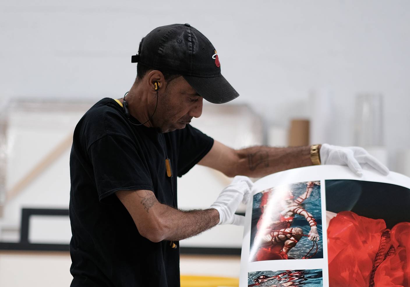
Not Soft-Proofing Before Printing
Skipping the soft-proofing step is another printing mistake that leads to disappointment. Soft-proofing lets you preview how your file will appear in print, based on your printer’s color profile.
By soft-proofing, you can make real-time adjustments to compensate for differences between screen and paper. This step is essential for achieving consistent results, especially in fine art reproductions where accurate color is critical.
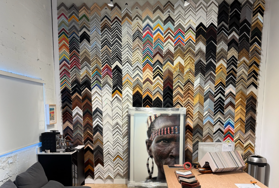
Overlooking Material and Finish Considerations
Your final print result depends not only on digital setup but also on the material chosen for production. Paper type influences how colors and textures appear. Glossy paper boosts saturation but can reflect light, while matte finishes provide subtle tones suited for fine art pieces.
If you prepare your file without knowing the print surface, your color and contrast settings may not align with the selected material. Always consult with your print shop to understand how specific finishes interact with your design. Adjust your file accordingly to match texture, brightness, and depth.
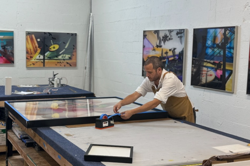
How Professional Support Prevents Printing Mistakes
Working with a professional print lab reduces the risk of costly printing mistakes. Skilled technicians perform preflight checks to confirm that file dimensions, bleed, resolution, and color settings meet professional standards.
At a trusted lab like The Color House Miami, we review files to confirm that every detail aligns with your intended outcome. Our team evaluates print-ready files for accuracy to get proper print resolution, correct color profiles, and consistent sizing. This prevents surprises and reprints later in the process.
Professional support also helps artists who are preparing files for print for the first time. The guidance means your artwork maintains its intended aesthetic when reproduced in tangible form.
Frequently Asked Questions (FAQs)
Q1: What resolution should artwork be for printing?
The best image resolution for printing is 300 DPI at the exact print size. Your files should match or slightly exceed these specs to deliver sharp, detailed results.
Q2: Should I submit files in RGB or CMYK?
Most print labs expect files in CMYK because RGB files can cause color changes. Always consult with our team to know more about the preferred profile for your job and convert your file before the final submission.
Q3: What are the most common print preparation mistakes?
Frequent printing mistakes include low resolution, wrong color mode, missing bleed, and submitting in the wrong file format. Not previewing with soft-proofing also causes output surprises.
Q4: How do I know if my file is print-ready?
Check file dimensions, resolution, color mode, and format. Your printer can confirm readiness through a preflight check.
Q5: Can a print lab fix file issues before printing?
Yes, professional printers can identify and correct technical problems before production. At The Color House Miami, we offer detailed file reviews to achieve optimal results. Please reach out to our team to know if we can fix the file issue.
Prepare Your Artwork the Right Way for Printing
Proper print preparation prevents costly mistakes and guarantees that your artwork prints accurately. Handling essential details like print resolution, bleed, and CMYK vs RGB color settings means your final product meets professional quality standards.
Partnering with an experienced print lab provides peace of mind through expert guidance, preflight checks, and accurate file adjustments. If you want to print your artwork, The Color House Miami can help.
We make your artwork print-ready. Our expertise has helped artists, photographers, and designers across Miami get exceptional, gallery-quality fine art prints every time.
Get your quote now!